How to Choose a Color Palette for Your Small Business Branding Photoshoot
Planning outfits for a branding photoshoot can feel overwhelming, especially when you want multiple looks that still feel cohesive. The secret is starting with a simple color palette. When your outfits coordinate around a few intentional colors, your photos feel polished, professional, and consistent across your website, social media, and marketing materials.
Start With Your Brand Colors
Look at the colors used in your:
- Logo
- Website
- Social media graphics
- Marketing materials
- Office space where we will be shooting
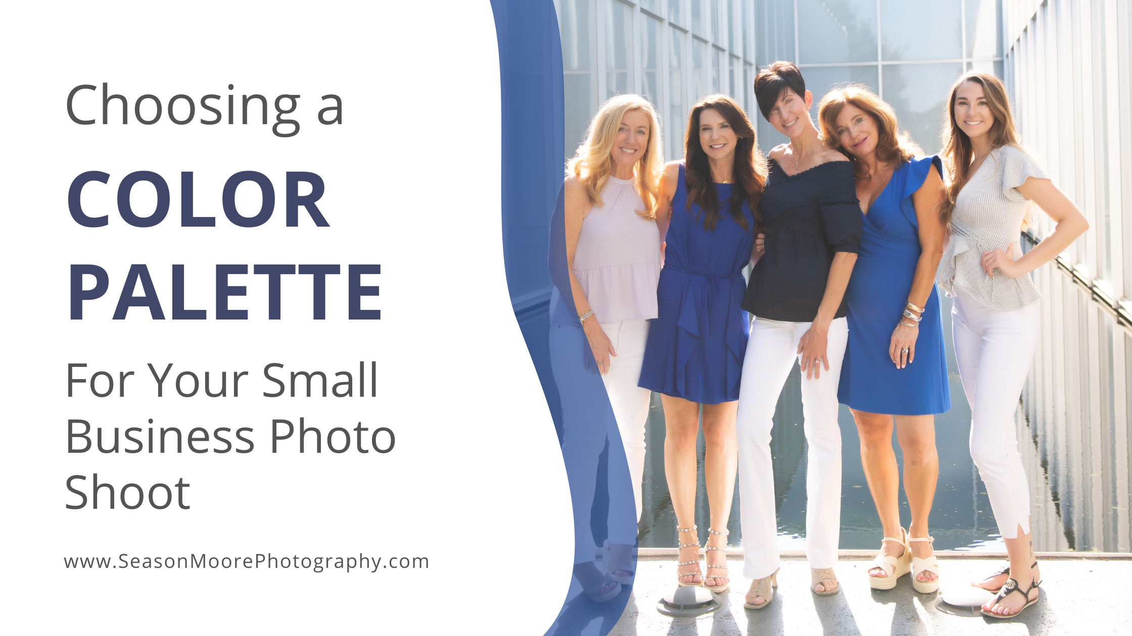
These colors already represent your brand personality, so incorporating them into your wardrobe creates visual consistency across your business. You don’t need to wear your brand colors exactly, instead, use them as inspiration for a coordinated palette. For example:
- A wellness brand may lean toward soft neutrals, sage green, and warm beige
- A corporate consultant might choose navy, charcoal, and white
- A creative entrepreneur might incorporate bold accents like coral, mustard, or teal

Build a Palette of 4–6 Coordinating Colors
Create a small color palette that everything will plan their outfits around. A good palette typically includes:
- 1–2 main colors
- 2–3 supporting neutrals
- 1 accent color
Example palette:
- Navy
- Soft gray
- White
- Camel
- Dusty blue
When all outfits pull from the same palette, your photos will feel cohesive even if the outfits are completely different.
Mix Neutrals With Statement Colors
Neutrals help keep your images timeless while allowing one or two pieces to stand out. Great neutrals for branding photos include:
- Cream
- Beige
- Camel
- Navy
- Gray
- Soft denim
- White
Then add a statement piece or accent color that reflects your personality or brand energy.
For example:
- A bright blazer
- A colorful blouse
- A pocket square
This balance keeps your photos interesting without becoming overwhelming.
Plan 3–5 Outfits That Work Together
For most branding sessions, I recommend planning several coordinated looks rather than completely unrelated outfits. Giving your team specific instructions prevents one team member from showing up in a suit and tie, and another in a tshirt. Examples might include:
- Professional
Blazer + blouse + tailored pants - Polished casual
Jeans + blazer + heels - Relaxed brand personality
Dress or knit sweater - Creative or bold look
Statement color or standout outfit
Even though the outfits are different, keeping them within your color palette helps them feel like they belong in the same visual story. If possible, have everyone bring in their items before the shoot. Hang them all together. and see if anything jumps out in a distracting way.
Avoid These Common Outfit Mistakes
When planning your branding wardrobe, try to avoid:
- Wearing completely different color families in each outfit
- Neon or overly bright colors that distract from your face
- Busy patterns that compete with your brand aesthetic
- Clothing that wrinkles easily
- For more on choosing colors, visit this page
Keeping things simple and coordinated ensures the focus stays on you and your brand.
Your Photos Should Feel Like Your Brand
Branding photos are more than just portraits, they are visual tools that represent your business. When your outfits align with your brand colors and overall aesthetic, your photos instantly feel intentional, professional, and consistent. With over 20 years of experience working with professionals, executives, and small business owners in Raleigh, I help clients plan wardrobe choices that photograph beautifully and support their brand. If you’re to book your small business branding photoshoot, contact us today!